Not that we’re calling you a dummy…
 In his talk at the U.S. Naval Warfare Development Command last Friday, CDR Bryan McGrath (ret.) made some important assertions about the affordability of our Navy in the context of the Federal Budget. At about the five minute point, he describes what he envisions as the ideal Navy to meet the United States’ security needs and proposes that it would cost about $25 Billion more than what we currently spend. He then goes on to place $25 Billion in context:
$25 Billion Dollars is:
- 4.6% of the base Defense budget
- 1.9% of the National budget
- 0.16% of projected GDP
“…so don’t tell me we can’t afford a bigger Navy,” commands McGrath. “We can afford it. We choose not to have a bigger Navy.”
If we’re going to talk about government spending, it is important to make sure we’re all reading from the same sheet of music. DoD advocates like CDR McGrath assert that the portion of national treasure we’re willing to invest in Defense is approaching record lows. Defense spending critics suggest that even in spite of cuts, we are throwing more money at DoD than at almost any point in history, to include the heights of the Cold War arms races. They are all correct; whether we are at a low point or a high point in defense spending is entirely subject to the frame of reference. Which reference we choose will invariably be determined by our motives.
Discussions of Defense spending are generally framed in one of three ways:
1. Defense Spending as a Function of Dollars Spent
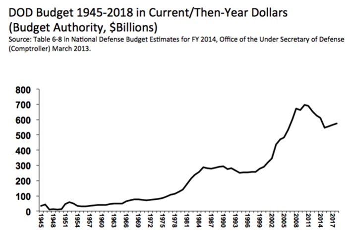
It’s hard to argue with cold hard cash. The money we spend on Defense has grown at an accelerating rate over the last century:
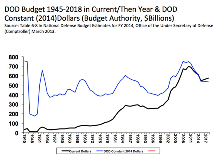
However convincing this graph is at first glance, you’ll find that only the most hyperbolic of critics of Defense spending will rest their argument on it. It is based on nominal or “actual” dollars spent, which do not account for the erosion of purchasing power that is inflation. We can correct for inflation by selecting a “base year” and then adjusting the dollar amounts at every other point to the purchasing power of an equivalent sum of money in the base year. Using 2014 as the base year, our corrected graph of defense spending looks more like this:
The blue line indicates what Defense spending would have been if the purchasing power of a dollar had always been equal to its 2014 value. While spending has oscillated pretty widely, the overall trend is positive: the price, presumably, of steady growth in things like technological complexity, personnel benefits, veteran health care, and administrative overhead. One major source of contention when framing arguments around inflation-adjusted dollars is exactly which rate of inflation is correct. Economists do not all agree, and DoD claims yet another rate of inflation from the economy at large due to a variety of factors.
2. Defense Spending as a Function of Resource Allocation
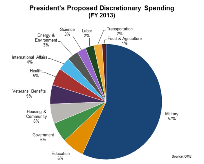
We’ve all seen a graph like this:
We can’t even balance the budget, and we’re spending over half of it on the military!? Preposterous!
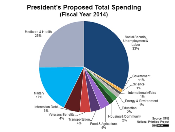
Are we really, though? Pay attention to the title: this graph shows “Discretionary Spending,” which is that portion of the federal budget that is determined by Congress through an appropriations bill. This is opposed to “Mandatory Spending,” which is the outlay of government funds required by law. If we include Mandatory Spending, allocation of federal spending will look more like this:
Mandatory Spending is effectively made up of entitlement programs. It is important to point out that in the fiscal sense, “entitlement” is not the sense of privilege attributed to Millennials by the previous generations. Entitlement is a technical term which describes expenditures which are not limited by any budget, but instead are a function of the number of people who qualify for them and the expenses incurred by the services promised. Because they don’t need to be re-approved every year, unlike discretionary spending, most entitlement expenditures will grow uncontrollably without a change in the law.
3. Defense Spending as a Function of Economic Output
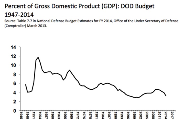
Described in terms of Gross Domestic Product, or the total economic output of the United States, Defense spending looks something like this:
The graph illustrates a downward trend in economic capacity committed to the military. Most DoD budget people will describe Defense spending in terms of GDP, ostensibly because it most accurately conveys economic burden. Bryan McGrath described his ideal Navy in terms of dollars, and then convincingly justified his position in terms of GDP.
Critics argue that using GDP as a yardstick merely serves the purposes of those who would seek more money by obfuscating actual dollar costs. Making sense of what is spent is made even more difficult by fluctuations in the denominator: GDP can vary wildly from year to year, which would appear on this graph as drastic changes to Defense spending. Yet another argument against measuring spending by GDP is that GDP is an estimate at best, and there is much disagreement between economists as to how it should be measured.
Bringing it All Together
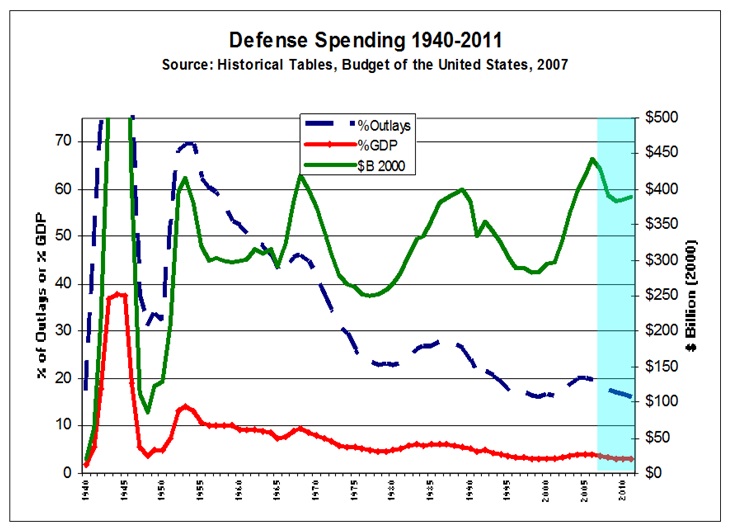
If we lay out the various methods of describing Defense spending on the same graph, we get something like this:
As you can see, Defense spending can look completely different depending on how it is framed. It can be described as a dollar cost, a portion of federal spending, or a portion of economic output. Each perspective illustrates important information that the others fail to address, and each one can be abused to promote an agenda.
LT Will Spears, USN, is an Active duty submariner; post-JO shore duty type. His last tour was aboard a WESTPAC Fast-Attack; he is now at NPS focusing on family and personal development. He is the author of the leadership blog JO Rules.
Note: The views expressed above are solely those of the author and do not necessarily represent those of the U.S. Navy, the Department of Defense, or the Center for International Maritime Security.

